Fitness Performance Analysis: What GPS Data Reveals About Exercise
SIADS 521: Visual Exploration of Data · University of Michigan · November 2025
On this page
Project Overview
The assignment was a real-world client engagement: a client who had begun tracking their exercise with GPS-enabled wearable devices provided a personal data export and asked for a visual analysis of what the data revealed about their performance and habits.
The deliverable was a computational notebook — structured as a narrative report — that used visualization to surface meaningful patterns in the data. The analysis followed the principles of Rule et al.'s ten rules for computational narratives, with each visualization building directly on the findings of the last and addressing limitations the prior chart couldn't resolve. The result is a four-part visual story that moves from individual session patterns to aggregate statistics to geographic context.
Skills demonstrated in this project
The Data
The dataset is a personal GPS fitness export from a wearable device, containing second-by-second sensor readings across 64 exercise sessions. Each observation includes timestamp, geographic coordinates, distance, speed, heart rate, cadence, altitude, and a set of running-specific biomechanics metrics (vertical oscillation, ground contact time, leg spring stiffness, and others) captured by an advanced running sensor.
Before visualization, the raw data required several preprocessing steps: converting timestamps to datetime objects, translating GPS coordinates from semicircles to degrees, converting distances from meters to kilometers, and computing derived metrics including pace (minutes per kilometer), elapsed time within each session, and elevation gain/loss. Sessions were also classified as running or non-running based on the presence of running-specific sensor data — a distinction that shaped which visualizations applied to which subset of the data.
The dataset presented an interesting structural challenge: duplicate columns with different completeness levels (e.g. two cadence fields, two speed fields). A correlation analysis confirmed these were measuring the same underlying metric, and the more complete version of each was selected for analysis.
The Visualizations
Each visualization was chosen to answer a specific question raised by the previous one. The analysis builds progressively — from understanding what happens within a single run, to comparing patterns across all runs, to understanding why those patterns vary.
Note on charts below: The original dataset is personal client data and cannot be shared publicly. The charts shown here are reproductions of the same visualization types using synthetic data generated to reflect realistic GPS fitness patterns — same structure, same techniques, same findings. The actual analysis was conducted on the full 64-session dataset.
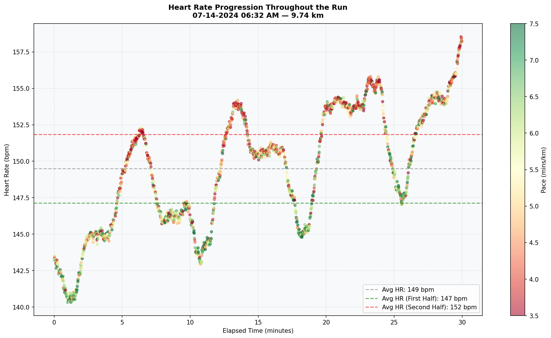
1. Heart Rate Progression Throughout a Run
The first visualization plots heart rate against elapsed time for an individual running session, with each point colored by pace. This surfaces two questions simultaneously: does heart rate increase over time due to fatigue (cardiovascular drift), and can pace changes explain sudden spikes in heart rate? A scatter plot is the right choice here because both axes carry meaningful continuous values, and encoding pace as a color gradient adds a third variable without cluttering the view. In the original notebook, a session dropdown allowed the client to compare patterns across all runs; the chart below shows a representative single session.
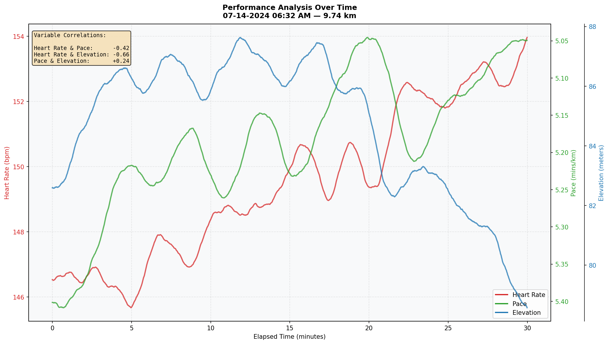
2. Multi-Variable Performance Analysis Over Time
The scatter plot raised a follow-up question: if pace alone doesn't fully explain heart rate variation, what else does? This visualization overlays heart rate, pace, and elevation on a shared timeline using three independent y-axes, with smoothed trend lines for each. An annotated correlation box quantifies the relationship between each variable pair for the selected session. Line charts are optimal for this because the data is time-ordered and the story is about how these metrics move together — or don't.
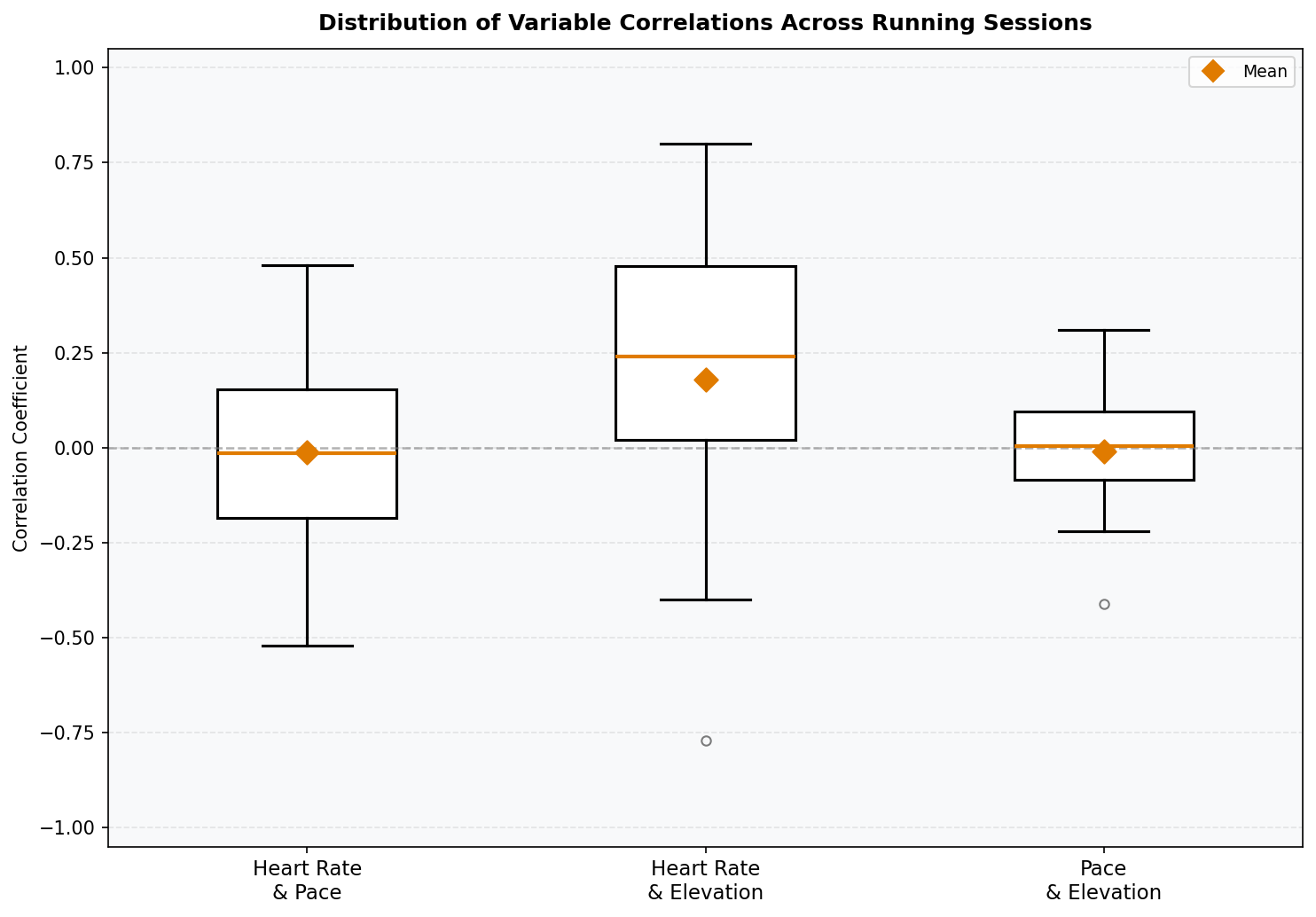
3. Correlation Distribution Across All Running Sessions
Visualizations 1 and 2 showed that variable relationships differed session to session. This raised a natural question: how consistent are these relationships across all runs? A box plot of correlation coefficients — one box per variable pair — shows both the central tendency and spread of each relationship across all running sessions. Box plots are well-suited here because the goal is to compare distributions across categories, and the median, quartiles, and outliers all carry meaningful information. Mean values are overlaid as diamond markers to distinguish average from median where the distribution is skewed.
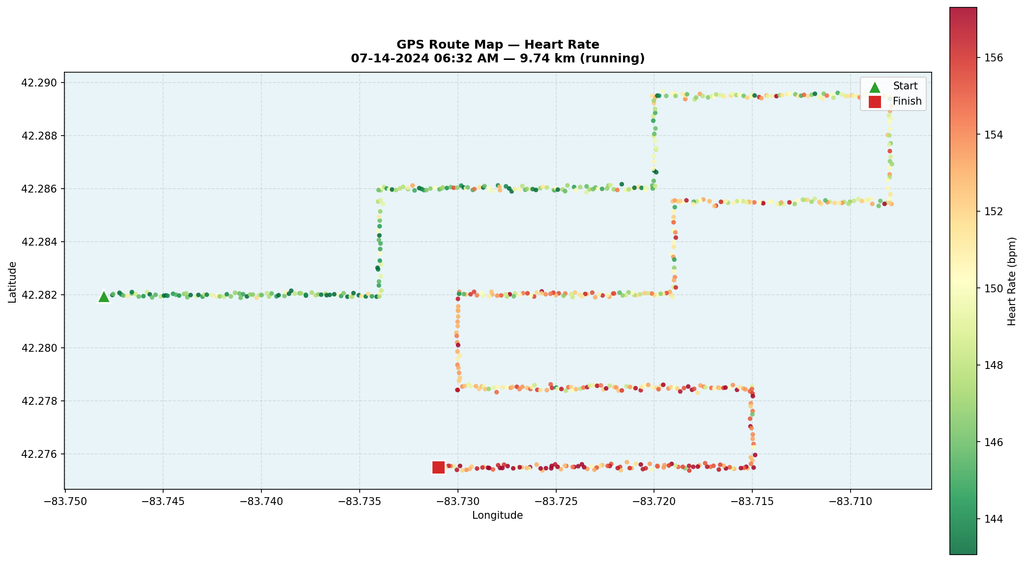
4. GPS Route Map with Color-Coded Performance Metrics
The box plot revealed that correlations between heart rate, pace, and elevation were surprisingly weak on average — but with wide variability. The geographic map was built to explain why. Using Folium, all 64 sessions are plotted as GPS coordinate sequences, with each point colored by performance metric: heart rate, pace, or elevation. Start and end markers anchor each route, hover tooltips surface per-point stats, and a color gradient legend provides a reference scale. This is the most technically complex visualization in the analysis — combining geospatial rendering, interactive controls, and performance metric encoding in a single view — and it directly answers the question the prior three charts couldn't: the terrain is what's driving the variability. The chart below shows a single representative route colored by heart rate; in the original notebook, both the session and the metric were user-selectable.
Key Findings
- Cardiovascular drift is real and measurable. Heart rate increases throughout most running sessions even when pace stays relatively constant — a pattern visible in the scatter plot across nearly every session. This indicates cumulative fatigue, not just momentary effort, is shaping cardiovascular demand.
- Correlations between metrics are highly session-dependent. The box plot showed that heart rate, pace, and elevation correlations cluster near zero on average — a counterintuitive finding. Some sessions showed strong relationships (±0.8), while others showed near-zero correlations for the same variable pair. Aggregate statistics obscure what individual sessions make obvious.
- Terrain explains the variability. The geographic map resolved the puzzle: most sessions in this dataset occur on relatively flat routes. Only a handful of sessions include significant elevation change — and those are exactly the sessions that produce the strong correlations and outliers seen in the box plot. The weak average correlations aren't a data quality issue; they reflect the actual terrain distribution of the workouts.